The Future of Gantt in 2024
Table of Contents
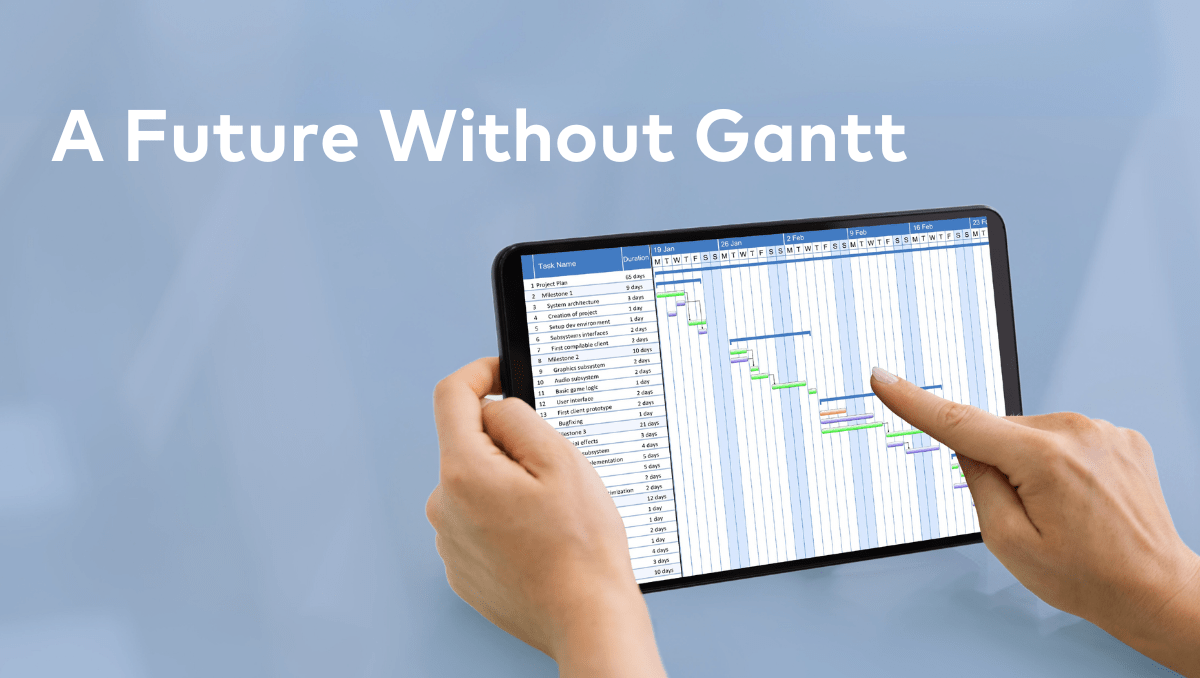
I’m just going to let the cat out of the bag now. The future of Gantt in 2024 is NO Gantt! Call me crazy to say that such a common tool used in project management today like Gantt can have no future, but the way the industry is trending, the answer is pretty clear. It is time to prepare for a future without Gantt because it is coming – sooner rather than later.
I’m not the only one who thinks this way…

I have yet to meet someone who honestly loves Gantt charts. If you are reading this and you like Gantt charts, then please, read this article and post your thoughts below. But I feel like I can confidently say that Gantt truly does not have a fan club. The tool is the “best option,” but it’s not really what project management professionals and executives want to use as their project management planning solution.
At every show that I go to, I hear a similar sentiment to what I have listed here below from online sources or conversations I have had with project management professionals. Does any of it sound familiar?
“I have a secret: I hate Gantt Charts. I hate the way they look. I hate the way people interact with them. I hate the time it takes to build one. I hate the way it encourages people to behave.”
“I realized that the reason Gantt Charts do not work for product development is that product development is a series of decisions, not a series of tasks.”
“They are so cumbersome to use. And then after I update it, I have to go and compile a separate report to report with.”
“They take so much time to update…”
“They are so complicated that they make it hard to understand everything that is going on.”
The intentions of Gantt Charts?
Now, of course, there is something to be said about the “intentions” of Gantt charts. Gantt charts are a visual attempt at putting your project data story together. And yes, it is a way to “map out” all the work that needs to be done. But just because there is good intent behind a tool doesn’t necessarily mean that that tool is the right tool for the job.
This is especially true when it comes to larger-scale projects and portfolios that become more complicated.
Adam Hall from And Digital explains some of the main issues with Gantt:

“Gantt charts are fixed. That gives them a veneer of reliability and objectivity. That’s why organizations often drop screenshots of a chart into multiple slide decks which are then handed round the organization as evidence of operational excellence. (This evidence is flimsy at best, but it might occasionally dupe senior management.)
While life shifts around a Gantt chart, the charts are usually fixed in place. They are framed and held aloft until the project is well and truly off-target. Only then will project managers scramble and cut the scope of the “less important” final stages of the project which is almost always quality assurance.
So then what are the fundamental issues that cause Gantt charts to be inflexible?
What are the main issues with Gantt charts?
Complication of Data
The bigger the project or portfolio, the easier it is for the data to become more complicated and as a result, harder to make confident decisions and achieve operational excellence. Rather than your data helping you to manage your projects, it becomes a nightmarish pile of data that ends up becoming a hindrance to decision makers, preventing them from working quickly and confidently.
Inflexibility
Adam Hall from And Digital explained this issue best, “The problem with Gantt charts is that they seem to articulate a worldview that is clear, ordered and precise. They make managers think they can influence time. They make you think that decision making around sequencing and moving work between teams is as simple as a swipe across a spreadsheet or a drag across a grid. We need this to happen earlier, someone says. Easy: let’s just drag it or squeeze the date a little.”
But here’s the fundamental problem. Work never starts on time, it doesn’t occupy full days of effort and it rarely gracefully completes on schedule with no repercussions. Work morphs and flexes. Things are discovered. People go on holiday. Communication breaks down. This has implications on the plan and causes projects to slip away, missing deadlines.”
Discourages Collaboration
Mastering a Gantt chart is one thing, but effortlessly communicating progress across the organization to your boss is another challenge altogether. Sharing it becomes a cumbersome task due to the intricate nature of the chart. Enlisting team members to update it independently poses a risk, as their input might disrupt the entire timeline you’ve carefully constructed.
The complexity of Gantt charts makes collaborative updates a precarious endeavor, potentially leading to unintended consequences for your project’s timeline. Thus, even if proficiency is achieved in handling Gantt charts, their seamless integration into collaborative workflows remains a persistent challenge.
So what is the future then?
Imagine a world where your projects and even your entire project portfolio can fit on one screen visually, mapped out on a timeline. Imagine a world where you can add or remove dependencies, move around milestones and tasks in a few clicks that automatically aligns the whole organization. Imagine organizing your resources and assigning tasks on that same screen. Imagine being able to report in real-time the most current timeline of your projects or even your entire portfolio with that same screen and with a few clicks that can be automated on a cadence.
That is the future of project management, and it all comes down to two new breakthroughs in Project management:
Project and Portfolio Maps
Instead of relying on the traditional Gantt chart, Proggio employs the user-friendly ProjectMap™, providing a seamless way to oversee and control your entire portfolio through a single, customizable timeline. This innovative approach allows for a dedicated workstream (don’t worry, we will explain this shortly). of projects for each team, streamlining your ability to focus on specific tasks without the need to navigate through numerous spreadsheets.
The ProjectMap™ enhances project management by offering an intuitive and consolidated view, simplifying the complexity associated with traditional methods like the Gantt chart. With this tool, managing projects becomes more efficient and accessible, enabling teams to navigate tasks seamlessly within a unified interface.
Bottom line, everything we were imagining before is actually in reality a tool that exists already. That’s Proggio.
Workstreams
Now, you may have noticed above that we mentioned a word, “workstreams” . Let us explain what this is.
So basically your project is made up of workstreams. They are the simple way you can organize the work that needs to be done on a project by the type of work that needs to be done in its related lane of work. Like the video shown above, you can then organize each area of work into its related lane horizontally across the entire timeline. This organization is what enables the map to put everything on one screen and simplify the process to make the data intuitively visually, easily manipulated to adapt to changes, and easily shareable to report on data quickly.
Workstreams is the framework that makes all of those benefits possible.
Conclusion
The blog article discusses the anticipated shift in project management away from traditional Gantt charts in 2024. We contend that the industry is moving towards a future without Gantt charts, citing widespread dissatisfaction among project management professionals. Gantt charts are criticized for their fixed nature, complicating data, inflexibility, and discouraging collaboration.
We introduce two alternatives for the future of project management: ProjectMap™ and Workstreams. ProjectMap™, exemplified by Proggio, offers an intuitive and consolidated view of project portfolios on a single, adjustable timeline, facilitating efficient project management. Workstreams, a framework explained in the article, organizes projects based on the type of work and related lanes, enabling a simplified, visually intuitive, and easily shareable approach to project data.
So in other words, the future you have been imaging is here, and it’s not Gantt Charts, it’s project mapping with the help of workstreams.